Overview
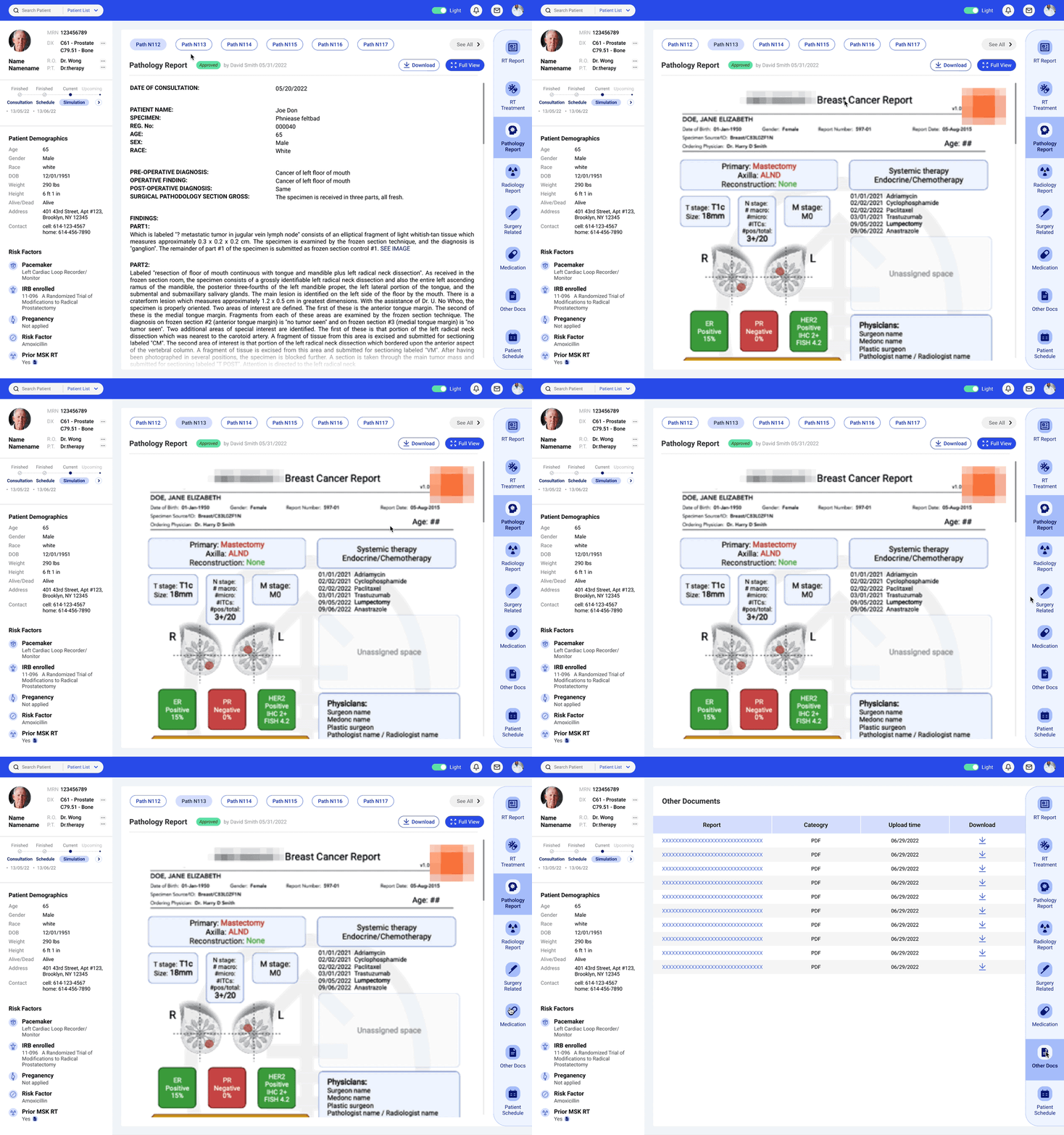
A substantial efficiency improvement on a reliable and efficient platform for combining patient data from multiple sources, and sharing longitudinal patient insights within the radiation therapy (RT) care team, empowering informed clinical decisions.
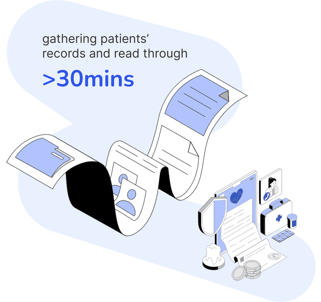
Reduce the patient records review time from
30
mins
to
3
4
5
6
7
8
9
mins
Productivity increase
3
4
5
6
7
8
9
10
x
Project Type:
Medical project, 0-1, Design to develop, end-to-end project
Team:
One PM, One design lead, group of four associate designers.
Time:
April 2022 - July 2022
My Contribution:
Competitor Analysis, Interview questions, Wireframe, Mid-fi, Final prototype
Software :
Figma, Figjam, Adobe Illustrator and Photoshop
Context
Integrated patient insight dashboard in radiotherapy
As one of the crucial part of cancer treatment, the radiotherapy (RT) treatment utilizes advanced algorithms and machines for precise radiation targeting. Efficient management of medical records is essential for delivering accurate and personalized treatment.
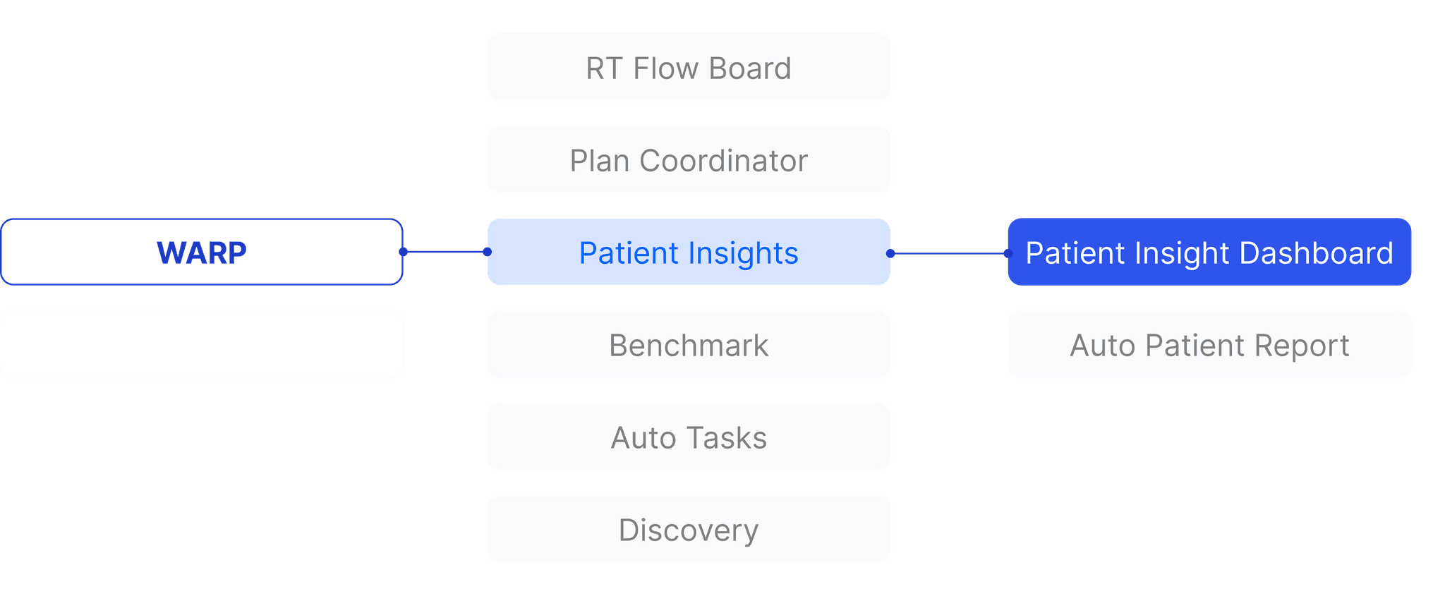
Our client, Memorial Sloan Kettering (MSK), a prestigious institute in RT, is developing WARP, an in-house integrated system for workflow automation and multimodality integration. As a part of this system, the patient insight dashboard provides a quick overview and seamless organization of patient data. It showcases essential diagnoses, longitudinal treatment data, and current treatment status, etc. Critically, the dashboard syncs this data with the rest of the system, ensuring the care team has access to the most accurate and up-to-date information.
Business Challenge
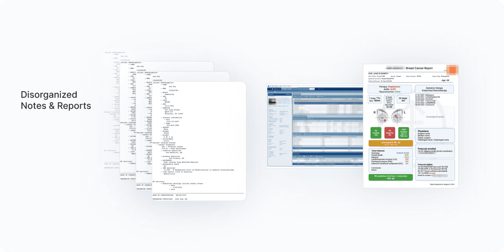
Overwhelming volume of patient data
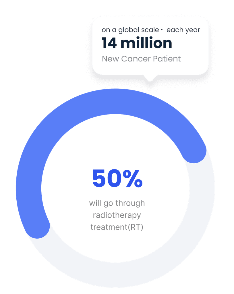
On a global scale, there are more than 14 million new cancer cases diagnosed each year. Approximately half of all cancer patients will undergo radiotherapy (RT) as all or part of their treatment plan. Memorial Sloan Kettering (MSK) handles vast amounts of patient data daily, which the medical team meticulously manages.
User Challenge
Inefficient medical record system before WARP
The new system is under developing. Before the new system launch , the team currently relies on various outsourced software to manage different aspects of patient care, which makes things complicated. Due to the limitations of the current system, medical staff allocate over half an hour per patient to gather diagnoses, treatment records, and other relevant information from various sources. This process, along with the vast daily influx of patient data, significantly burdens the workload. An integrated system developed in-house could potentially streamline these processes.
User Research
We talked to the medical team
In the beginning, we conducted an expert interview with a medical professional (oncologist) and the manager of MSK’s computational radiation therapy team. This team is focused on workflow automation and data integration, and the manager is also the project manager for this project.
The communication does not stop there. Throughout the entire design process, we maintain a weekly meeting routine to showcase design progress and ask clarifying questions. This continuous feedback loop will be demonstrated in the later design phases.
We tried to understand
Who are the key stakeholders ?
What does their daily work look like?
What is the process of treatment ?
How do they collaborate within the team ?
What do they expect from this dashboard ?
Three Core Personas
With the communication with the PM and medical team, we quickly identifies three targets users.
Radiation Oncologist
Key Protocols Decider
Key protocols decider who will determine the most appropriate course of treatment.
They need to read patient past treatment history clearly
Medical Physicist
Detailed Treatment Planner
Detailed treatment planner who rely on all detailed patient info to effectively make safe and efficient plans.
Radiation Therapist
Treatment Executor
Treatment executor who need to know
all treatment details
the whole treatment schedule
Key Insights
We learn from users and the competitors
Need 1
Efficient data access and clear communication for team alignment
Care team members could get their required data as quickly as possible
Prioritize essentials
Highlight the key information
Clear communication between the care team members
Need 2
Handle rich data and display comprehensive patient information
Summary of the patient’s current status
Show the longitudinal patient records
Be able to drill into the details as needed
Include the all data type, structured or unstructed data
Data Organization
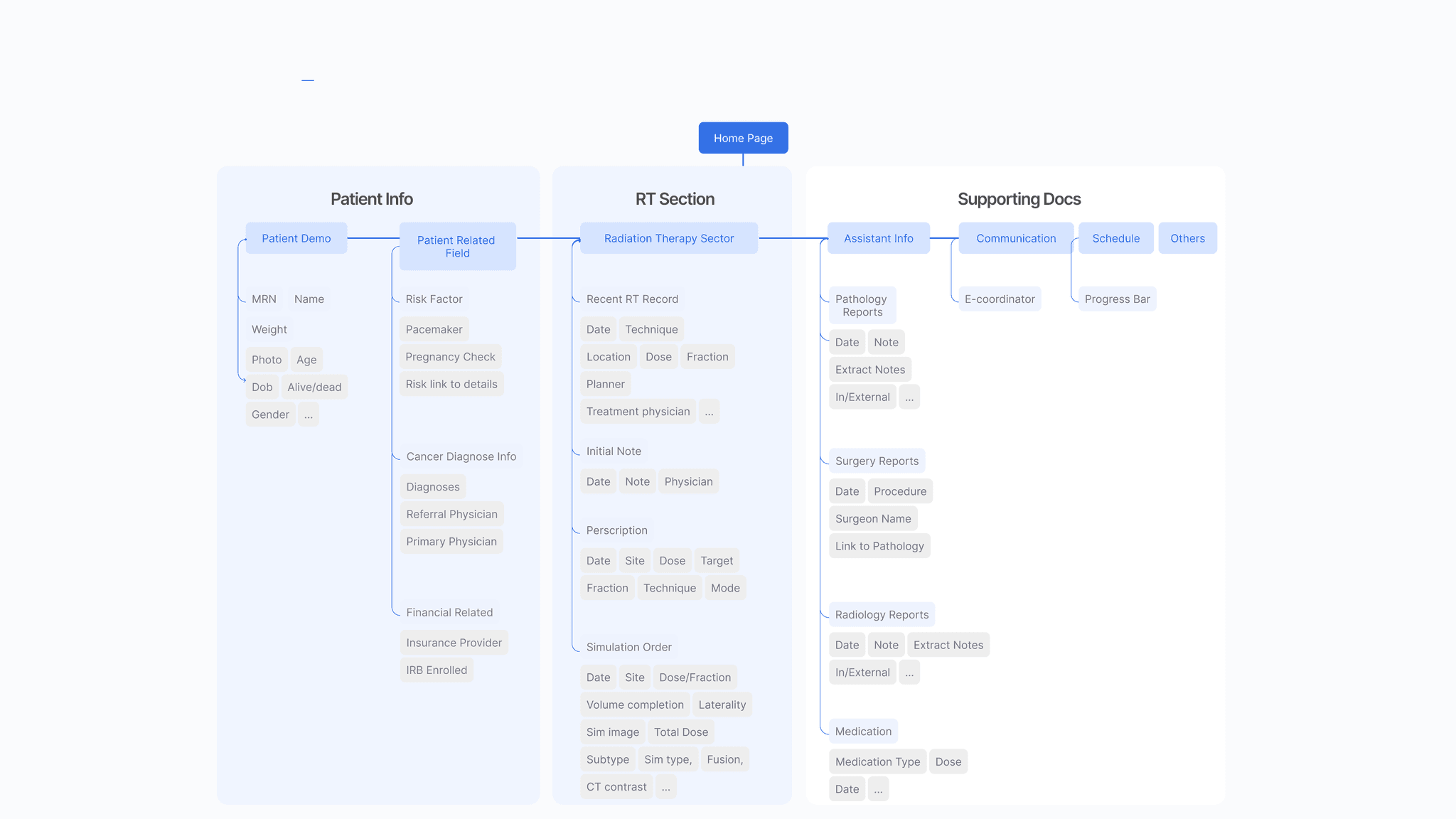
Build data structure
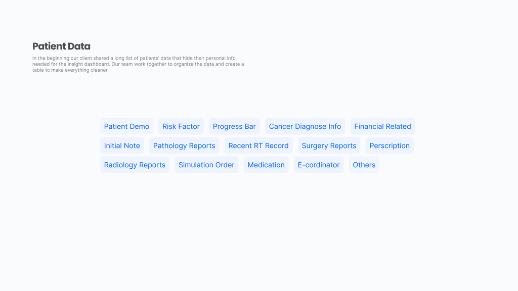
In the beginning our client shared a long list of patients’ data that hide their personal info. needed for the insight dashboard. Our team work together to organize the data and create a table to make everything cleaner
Prioritized List
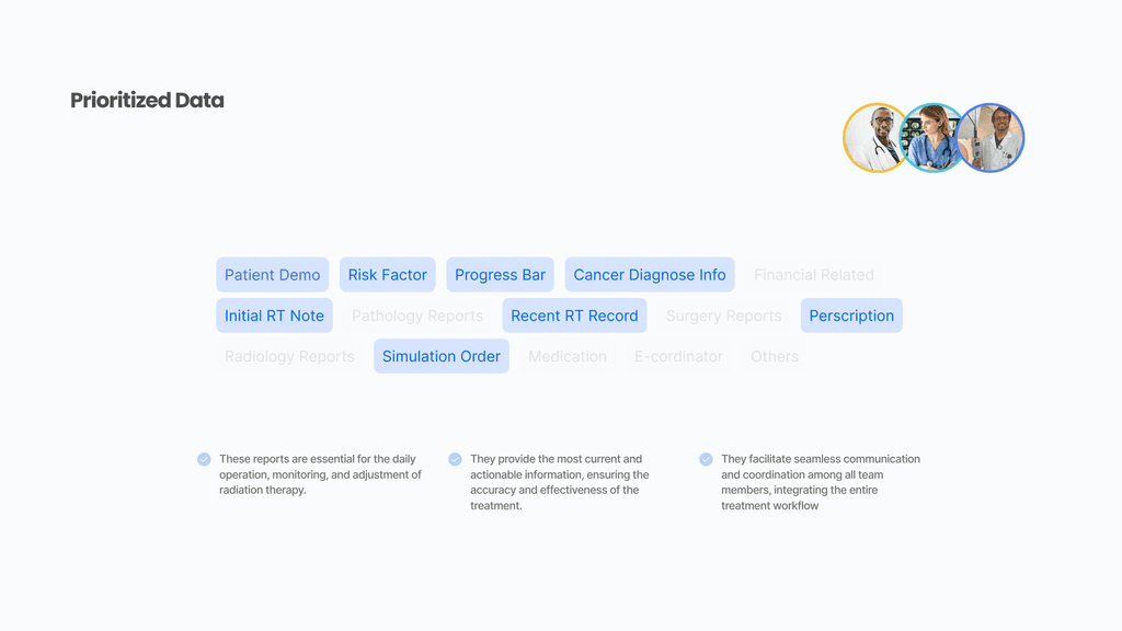
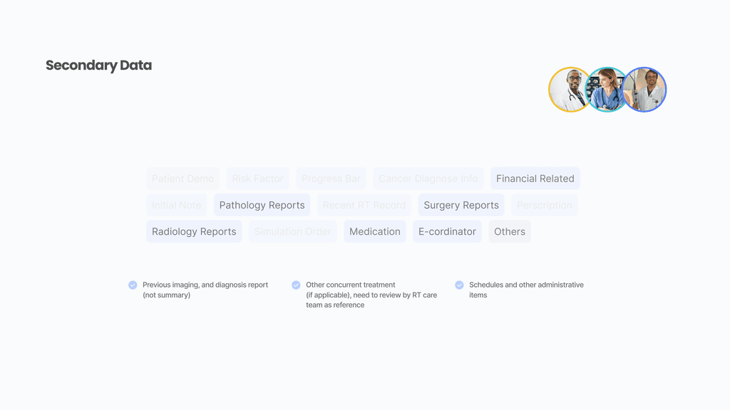
The main list view sorts data based on importance, with the most critical items at the top. Users can still access less important data by scrolling or filtering.
Information Hierarchy
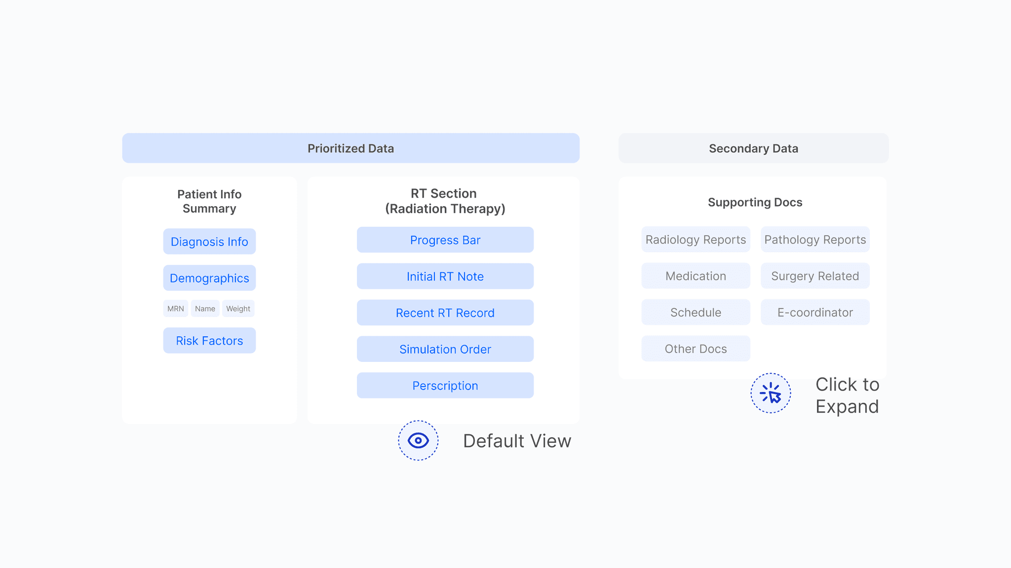
Based on the communication with medical team, the first priority should give to patient info sector and RT sector where the entire content needs to be glanceable without click through or scroll ups and downs. Other data are supporting documents can be folded
Layout Exploration
A clean dashboard with glanceable essentials
Based on research and insights from previous studies, the team made multiple attempts at basic layouts. After presenting the options and testing them with the medical team, we decided to proceed with the option that features three clear sections. Here's how we narrowed it down to the preferred layout.
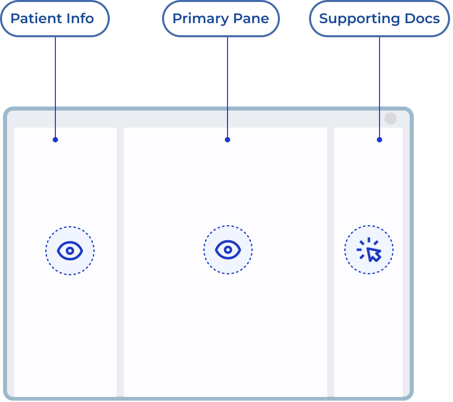
Preferred Layout
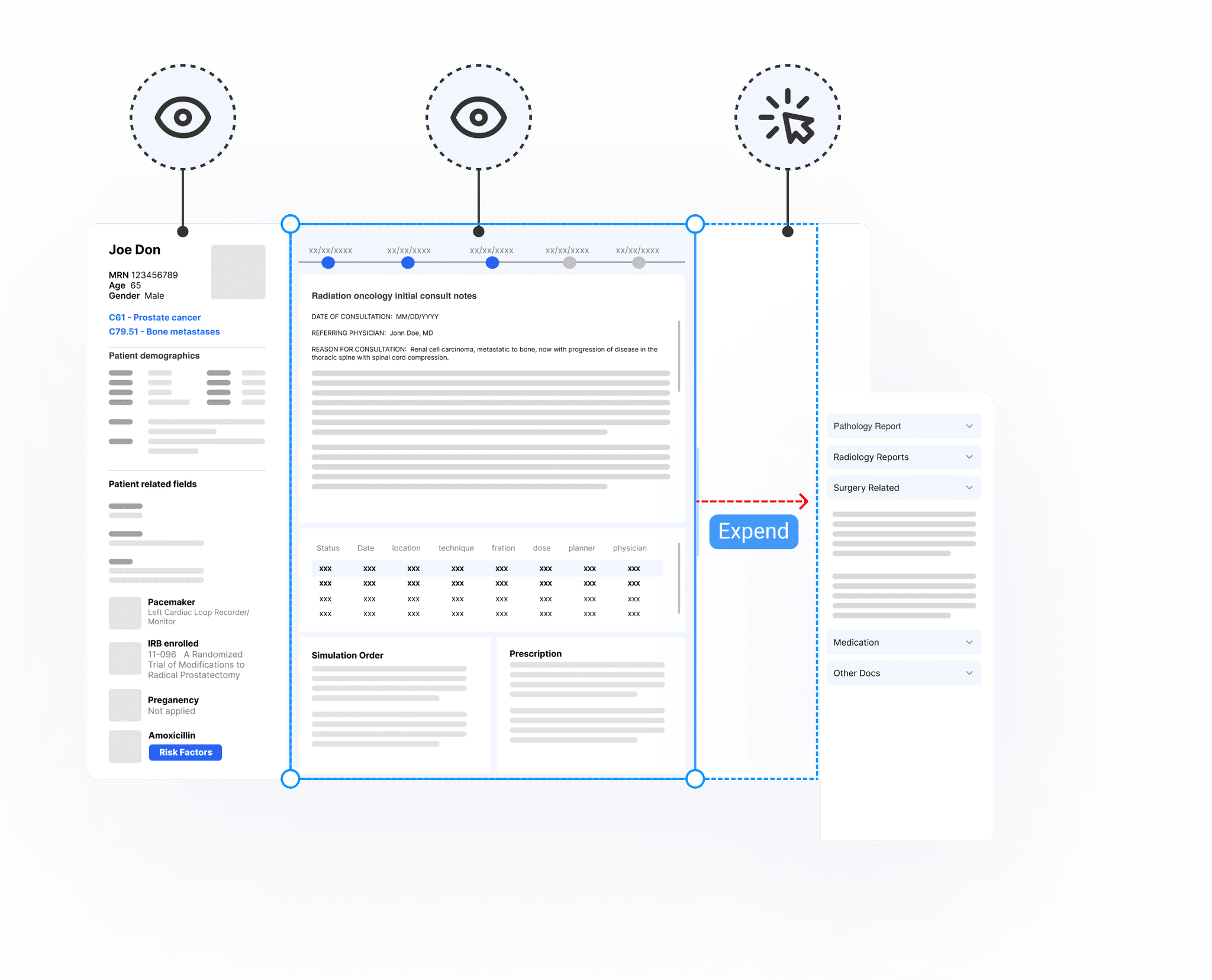
Here are some key decisions we made:
A dedicated pane on the left that remains visible for patient info, making it the first thing users will see
A primary pane that remains visible for patient info., showcasing RT treatment and notes at first glance. They are what all personas enjoy to see
A supporting pane that allow clicking to uncover more details
A complete patient list folded from the home page since it takes much space
Exploration
Option 1
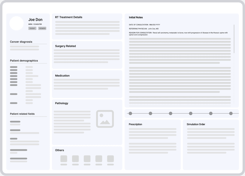
Three sections based on data organization
Straight forward layout clearly indicates the result of data structure and hierarchy.
Uncovered patient info, RT section and collapsed other sections are well displayed in propotion
Main sections take up too much space, limiting expansion space for the collapsed section.
To unveil the supporting section, a seperate window need to be opened or expanded to the left.
Option 2
Bento style
Trendy dashboard style with wedges offering a sneak peek of every section
In this particular case, many notes and reports are difficult to get the extracted data
Summarizing data into wedges isn’t feasible due to the need to maintain original format.
Option 3
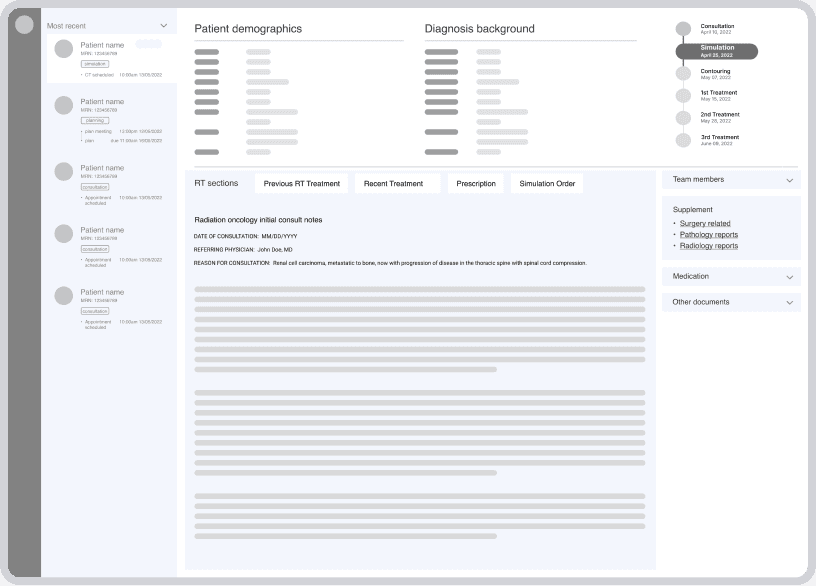
Drawer style : Click to open
Suitable for RT section, similar to Jira style.
Insufficient space for other supporting sections.
Lacks flexibility for application to documents other than the RT section.
Option 4
Full patient list
Facilitates efficient patient location.
Consumes too much space, impacting other higher-priority data sections.
Design Challenge 1
Information Density: Maintain a clean and uncluttered user interface
If we keep both patient info and RT sector visible, the majority of home page will be eaten up. Supporting pane is very limited compared to the data we got from client, we need either adjust the window size leaving more room for unfolding supporting document or lead to a separate link.
Is it necessary to keep the RT section always visible?
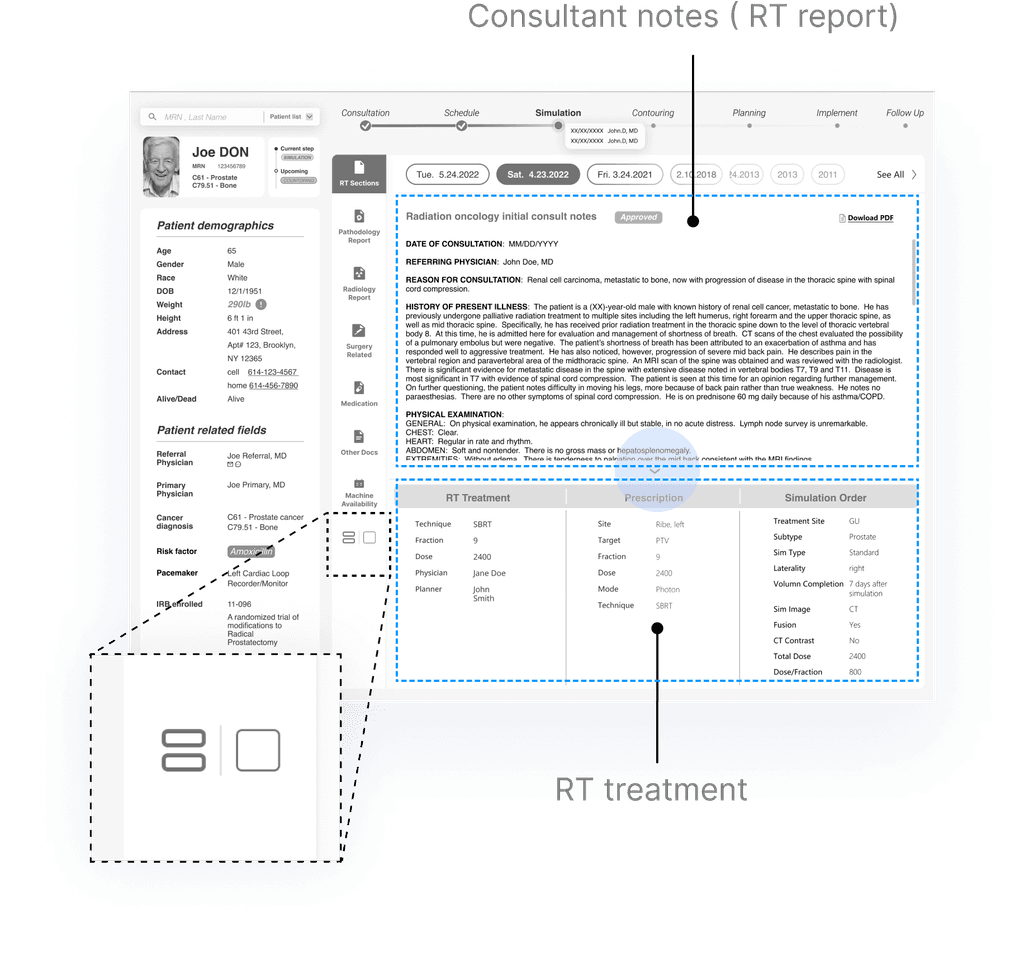
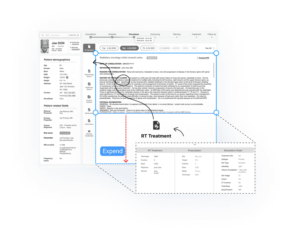
We brought this issue to medical team. After test with users on several options, we keep the priority of RT sector, however instead of always on, we make the RT info unfolded by default in order to make it visible at the first glance.
Ambiguity cleared up
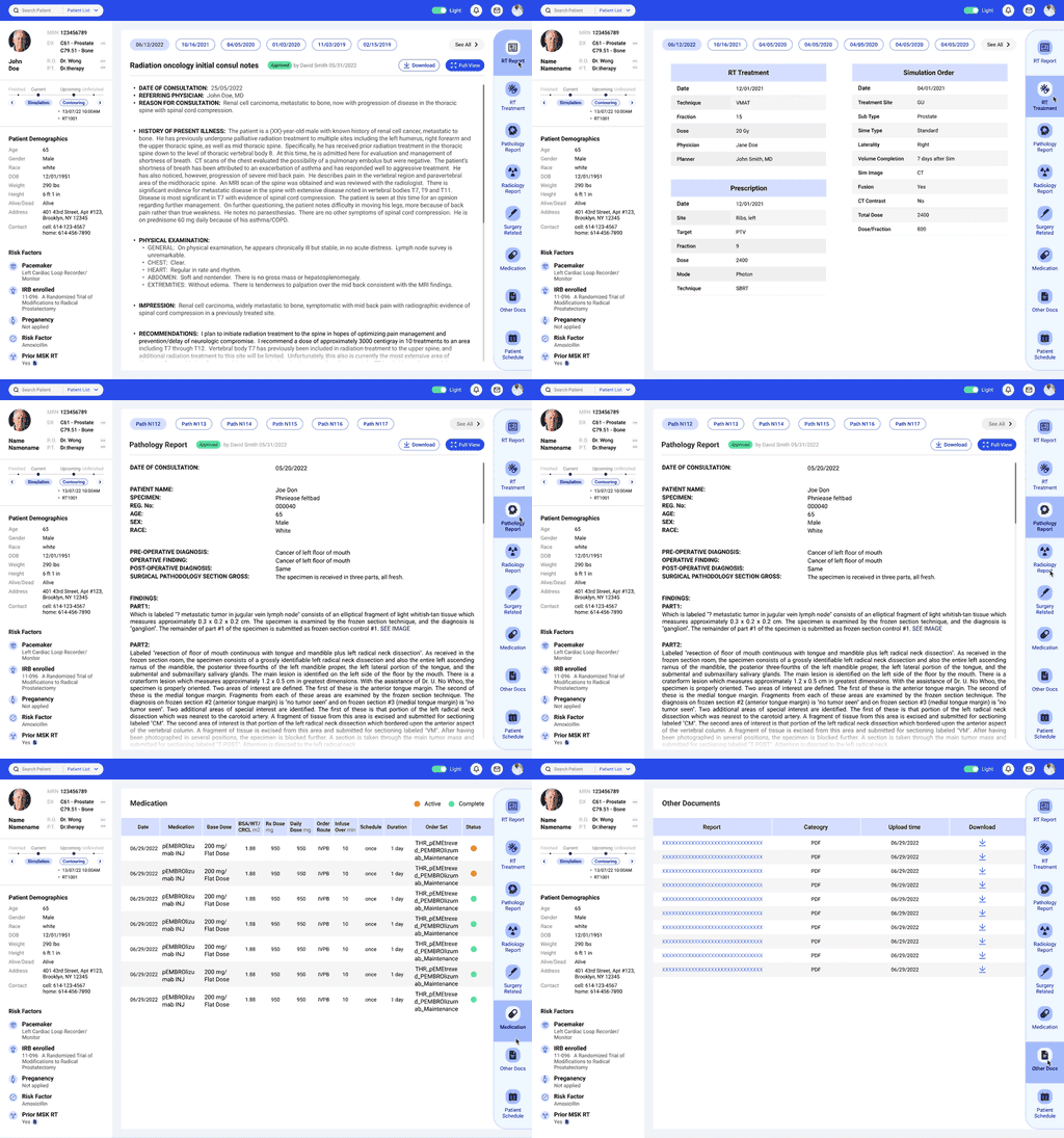
Then instead of keep exploring hundreds of ways to expend supporting docs to left, we simply utilize toolbar (vertical tabs) to solve the problem.
Prioritized Data
Remain Visible
Prioritized Data
Unfold by Default
Secondary Data
Details on Demand
Version 1
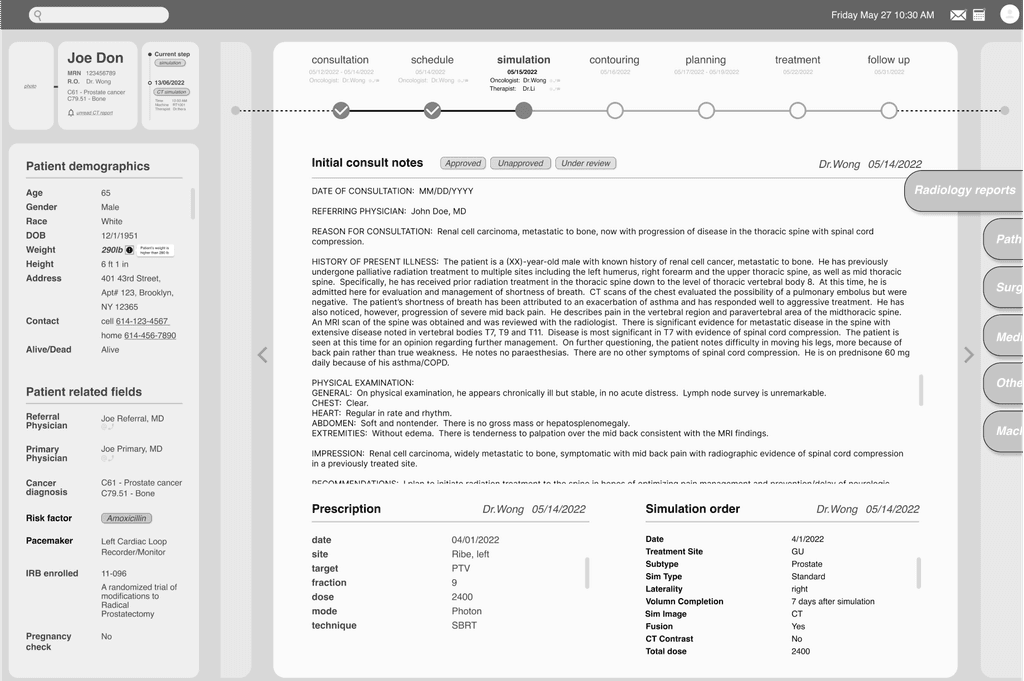
Always-on RT section and other supporting docs in accordions
Having the RT section always on since it's important to every user and provide a base guidance through the entire treatment process
This version was proposed when we have no idea how much the supporting docs will take
Version 2
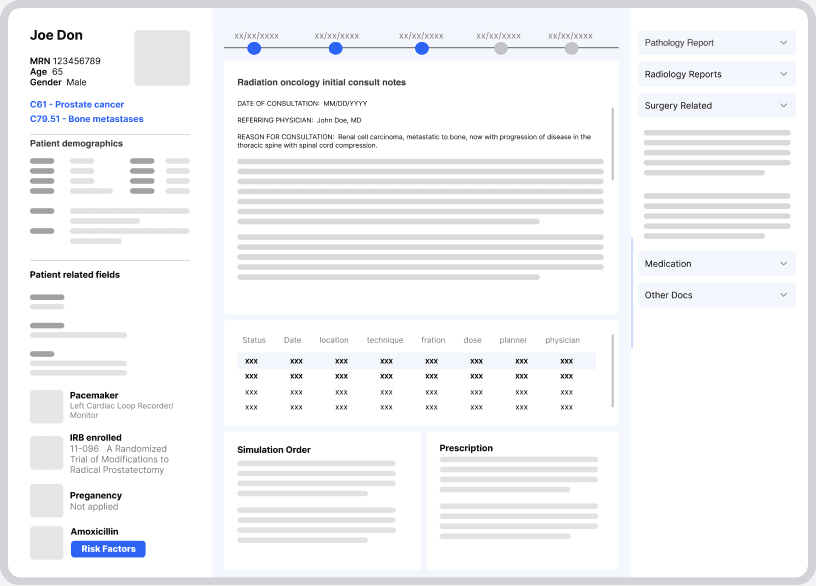
Toolbar (vertical tabs) with default view of RT section
Typical dashboard with wedges providing a sneak peak of every section
Browse dozens of professionally designed templates. Click, duplicate, customize.
Wireframe
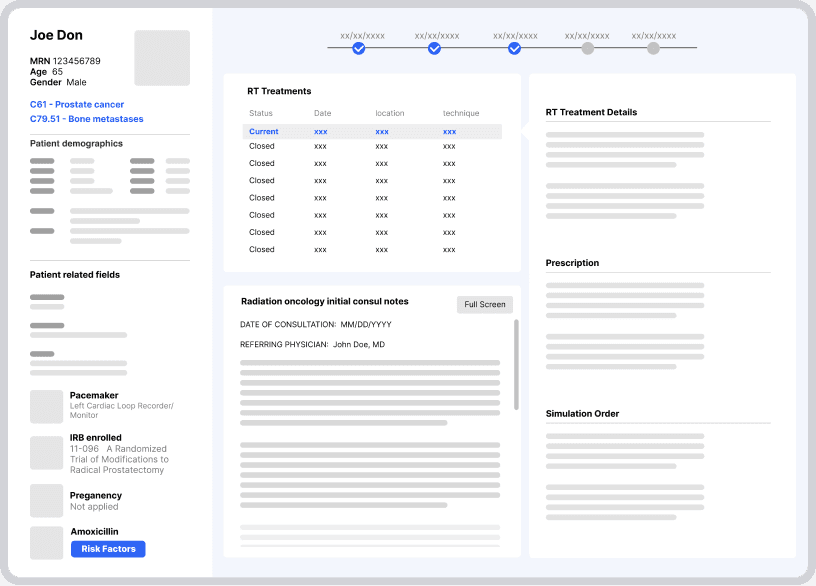
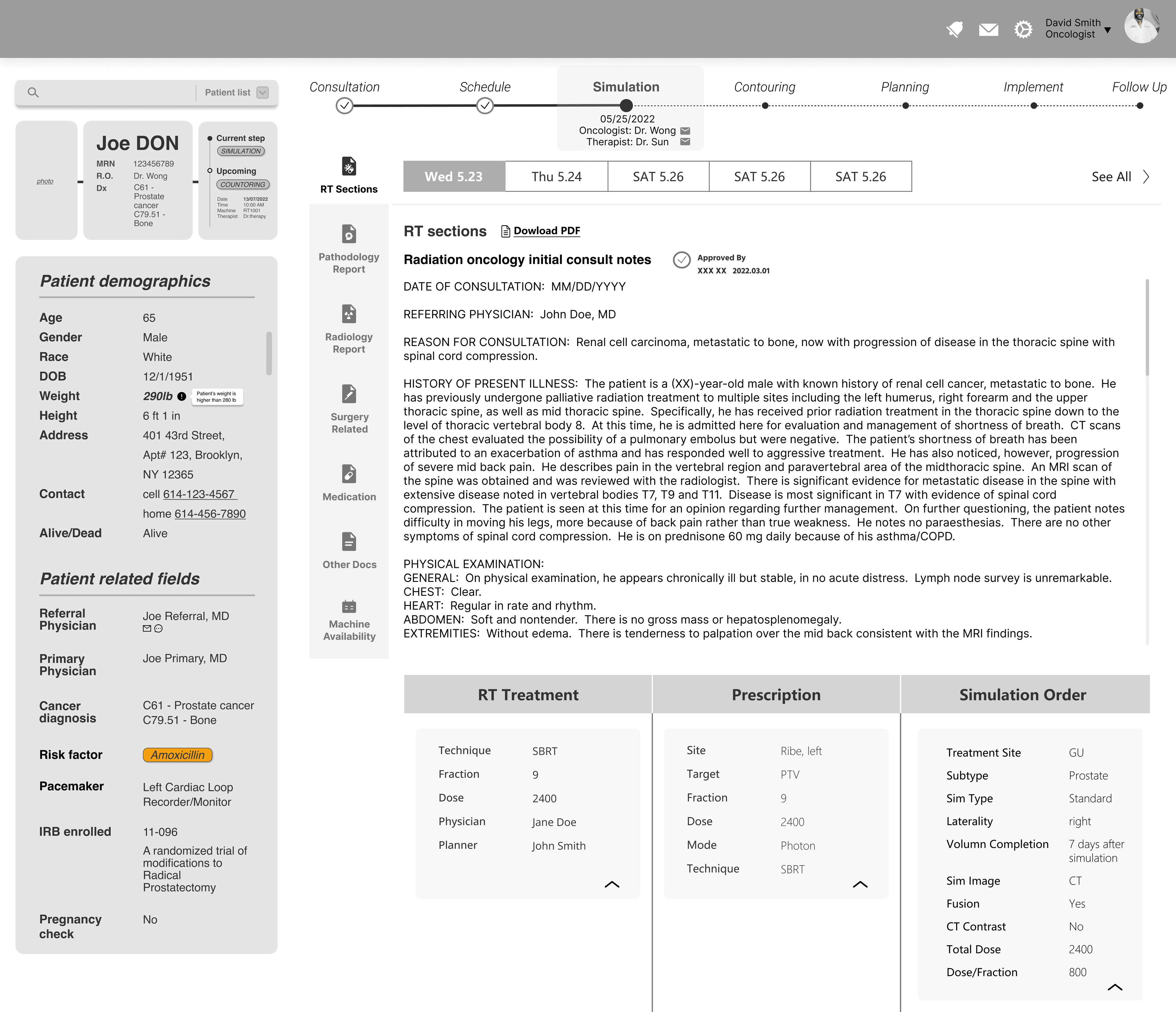
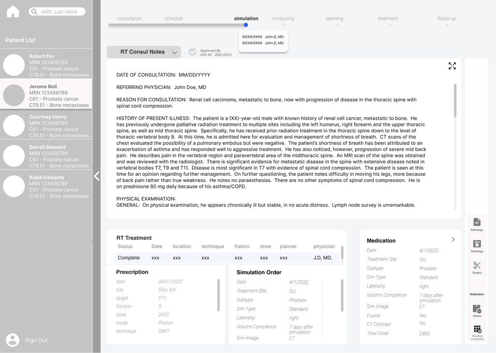
RT report and RT treatment were treated as a holistic RT section. Then reports and treatment on same day can be displayed side by side. But still a bit cluttered on default page.
Final
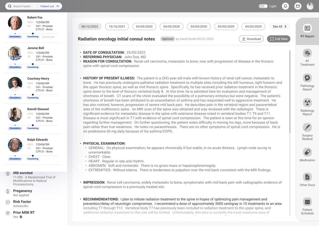
RT report and RT treatment in seperated tabs
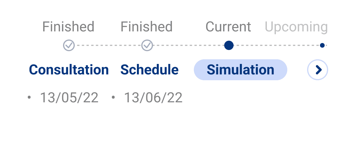
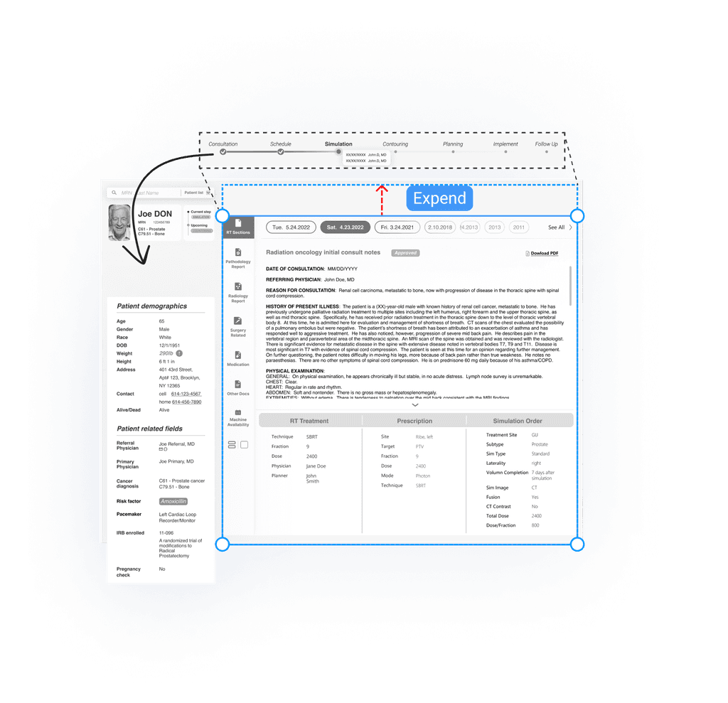
Treatment progress bar moved to patient info section, because it's more relevant and should be always-on
Exploration
Option 1
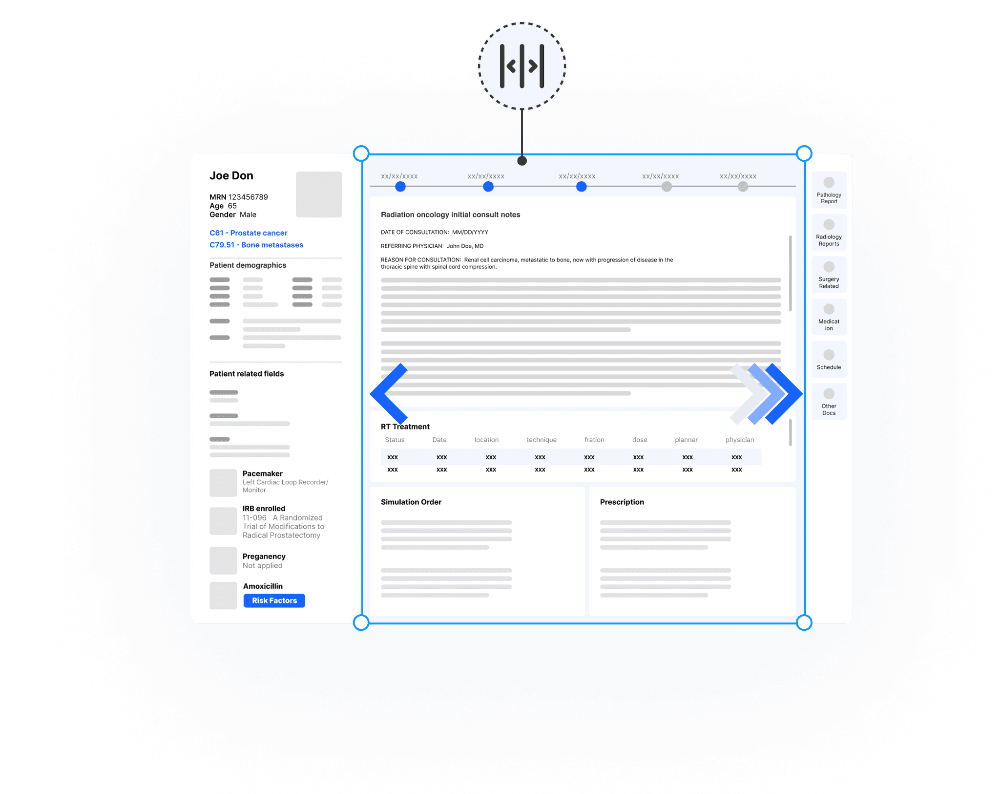
Split the windows or choose full view for consultant notes or treatment info
Flexible to choose between full view or side by side note and treatment from the same date
A little too complicated from both interaction and technical perspective
Option 2
Preferred
RT treatment on a separate tab
Make the dashboard a lot more cleaner
Finding and comparing corresponding treatment details and consultant notes for the same day across different tabs can be less efficient.
Option 3
Preferred
Treatment process bar moved from RT section to the patient section
the current status is glanceable and straightforward, ensuring it is always visible
It takes up much space in the patient information section, requiring careful use of the remaining space to avoid a crowded layout.
Design Challenge 2
Present longitudinal data efficiently
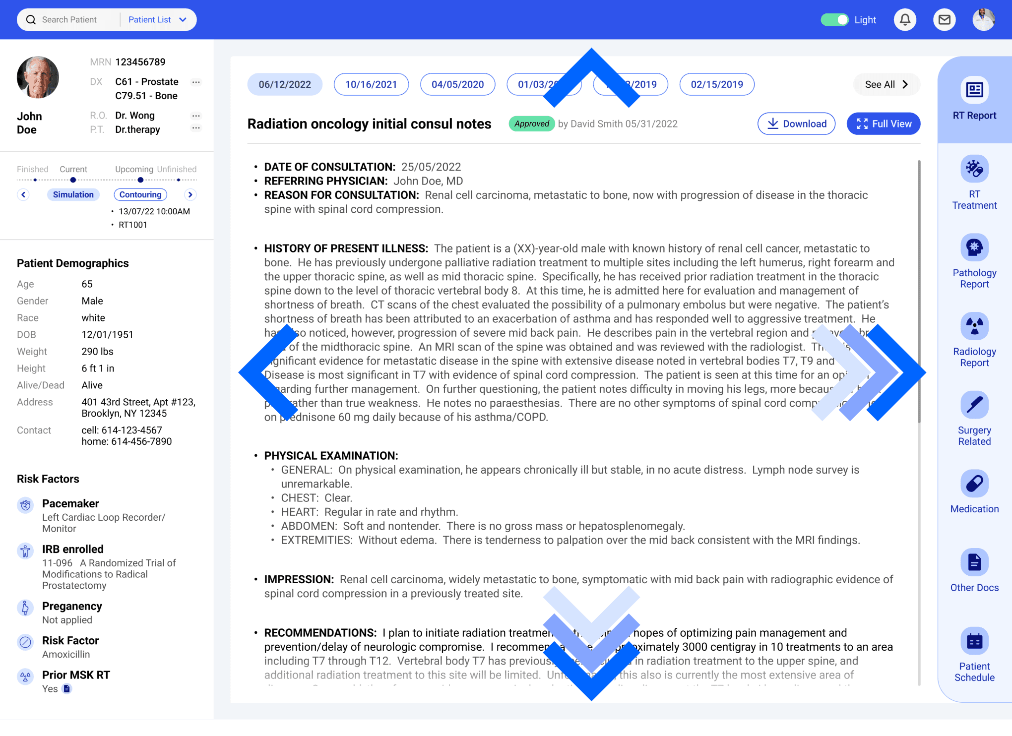
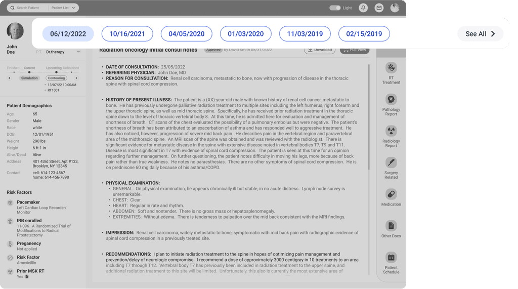
Dashboard will show the longitudinal patient records that can help the care team have global overview the patient treatment history. It is also able to reflect the current patient treatment situation.
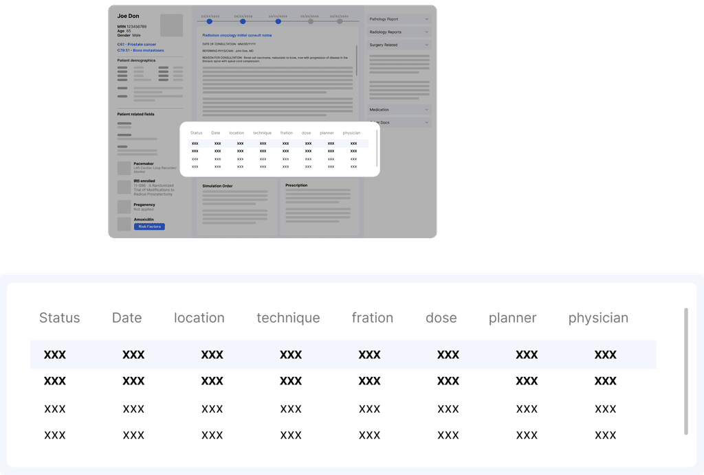
Before
Table helps to make high-level info of historic reports glanceable. But it takes too much space.
Final
Tab turns out to be the most efficient way to display longitudinal data.
Also provide an access to drill into more.
Exploration
Option 1
List longitudinal data in table w/ high-level info
Make the high-level information of RT treatment glanceable
Easy to locate a historic files
Take too much real estate
Option 2
Carousel
Most engaging interaction compared with other tab and table
Cannot have a overview of all the reports.
Easy to get lost when dealing with multiple historical reports. Hard to locate a specific file.
From a technical point of view, the implementation is the most complicated within all options
Option 3
Preferred
Tab allows quick overview and access to all the history reports
Tab allows quick overview and access to all the history reports.
By adding a “see all ” tab, it provide another access to all files listed in a table
Design Challenge 3
Patient section: highest priority, limited space vs. substantial amount of critical information
The patient section presents a significant challenge due to its high priority for all target users and the limited space available. Despite these constraints, it is essential to include a substantial amount of critical information.
Final
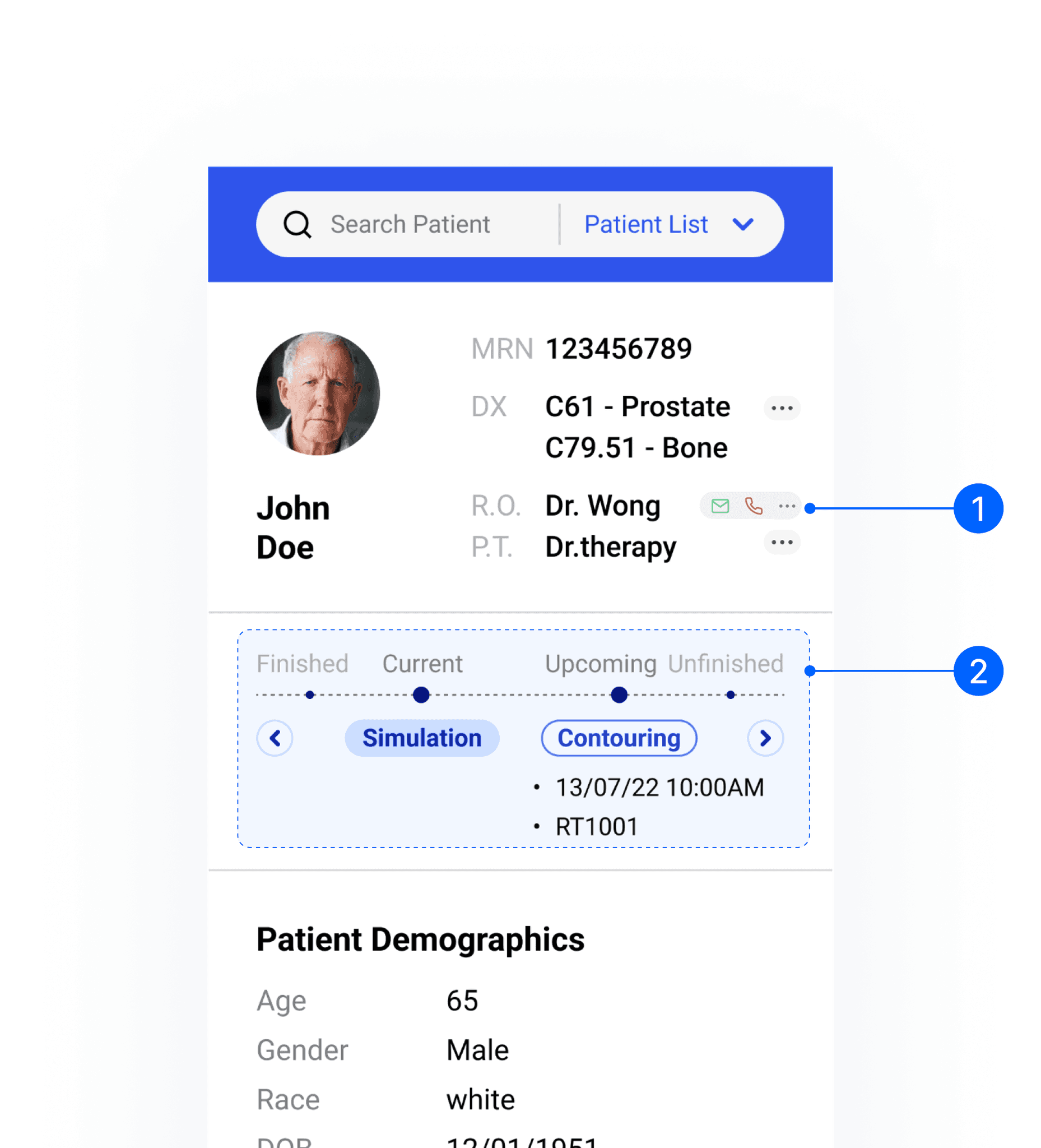
Moved the physician contacts to the top left, designating it as the most important section.
Placed the process bar directly below the critical patient information, smoothly syncing with the team, ensuring that the entire medical team is on the same page about the patient
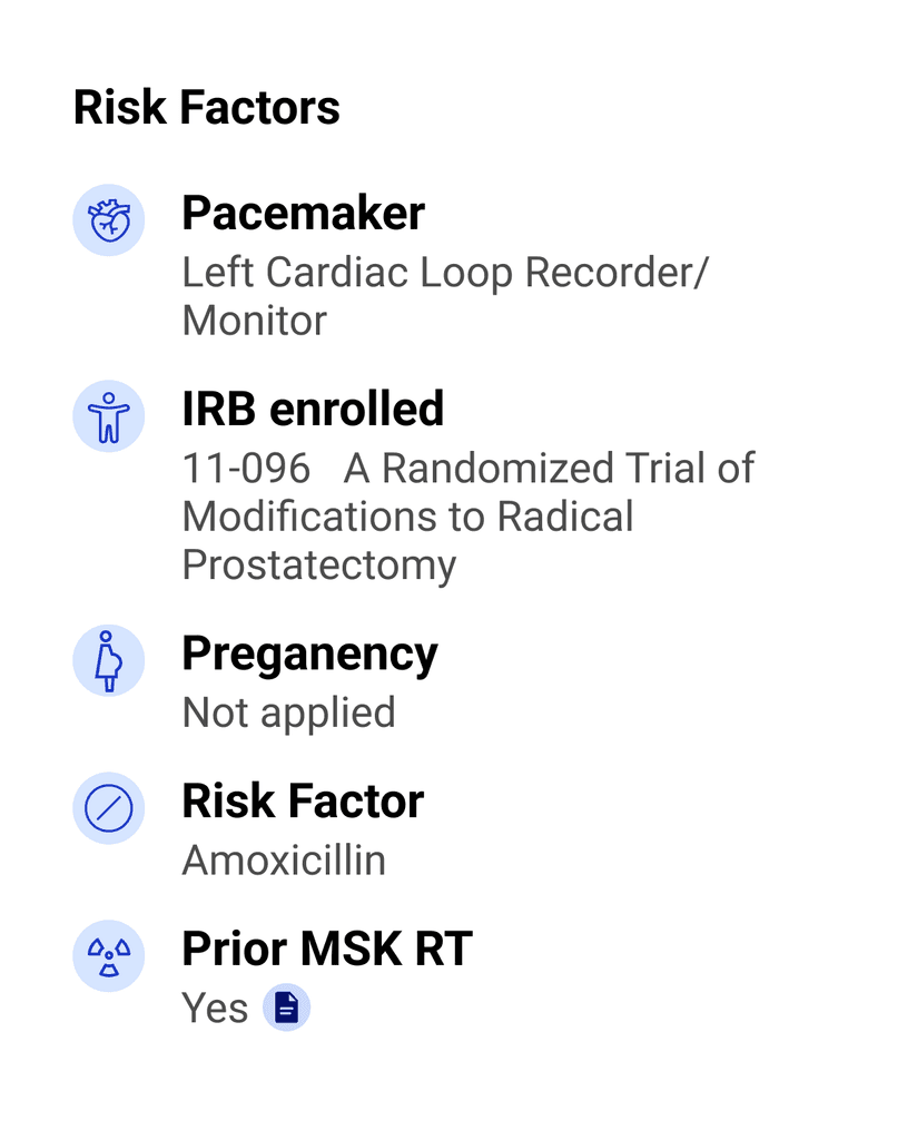
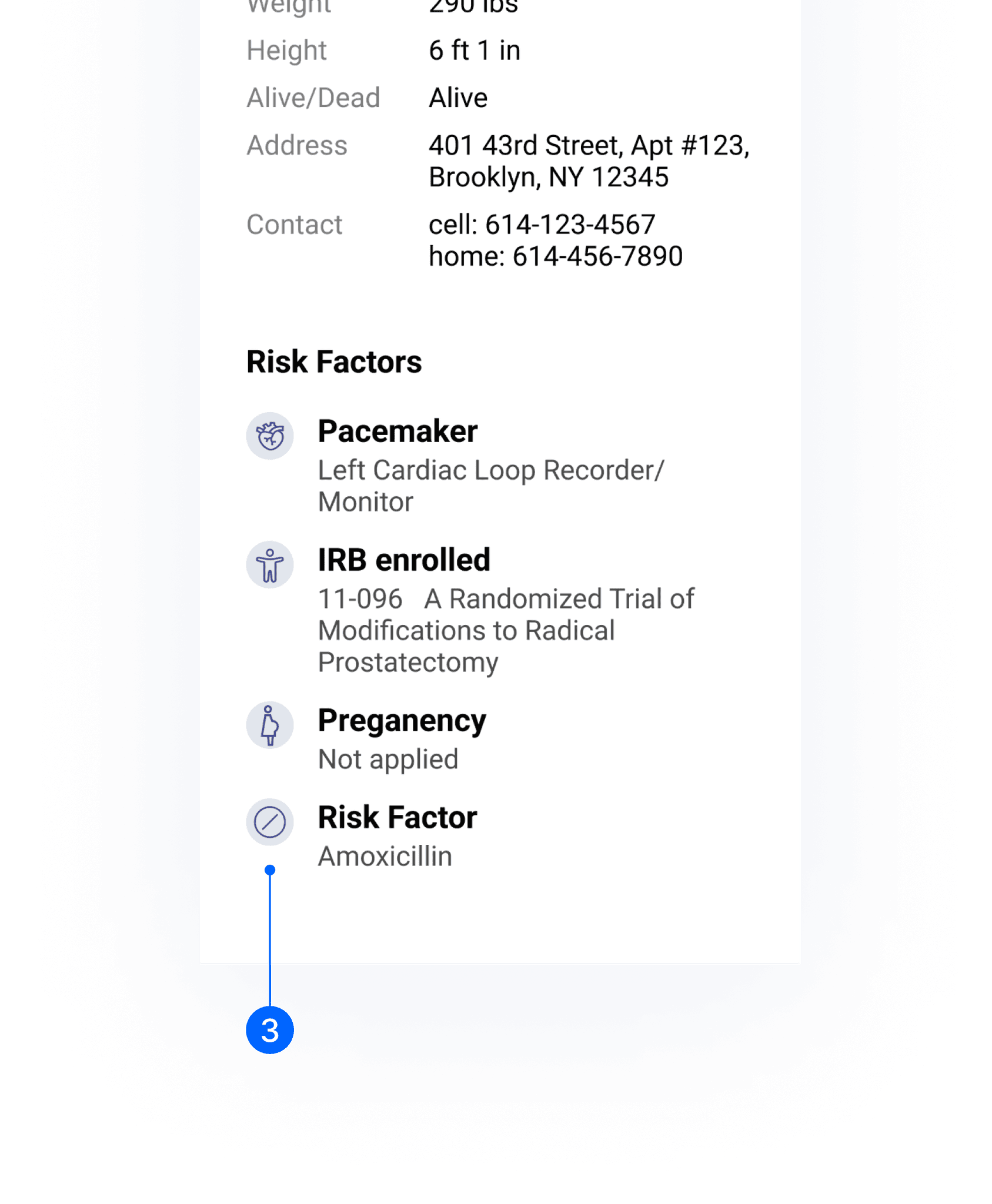
Utilized iconography to emphasize the risk factors.
Previous Version 1
• Clearly shows the hierarchy of patient information.
• Crucial information is highlighted with larger and bold font.
• Risk factors are emphasized using iconography.
• Only a link to the full schedule is available, lacking an overview of the patient’s current status in the treatment process.
Previous Version 2
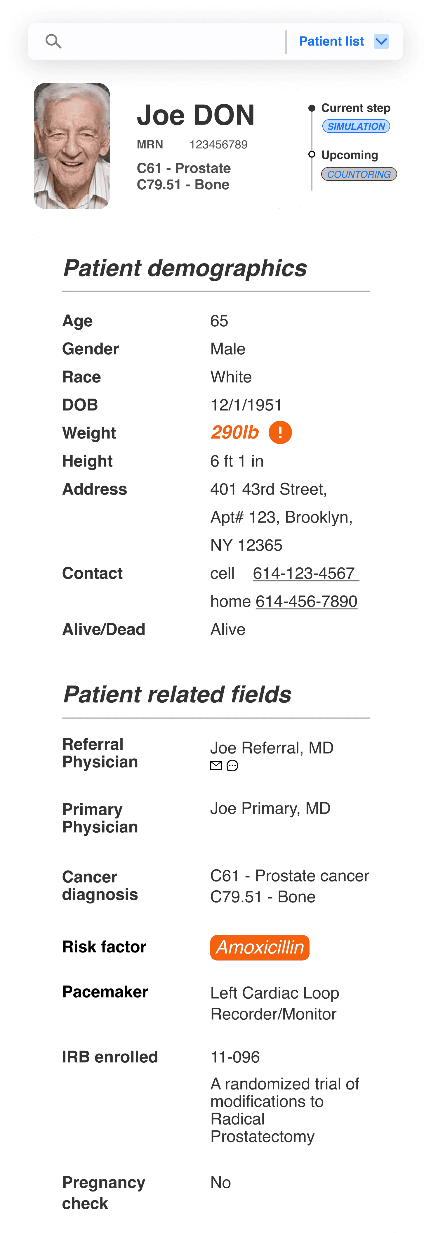
• Prioritized information is clearly positioned at the top of the column, establishing a clear hierarchy.
• The rest of the information is neatly displayed and organized by size and spacing.
• Important factors such as weight and risk factors are highlighted effectively.
• The email link has been moved to the top right of the window bar, which may not be clear enough for communication purposes.
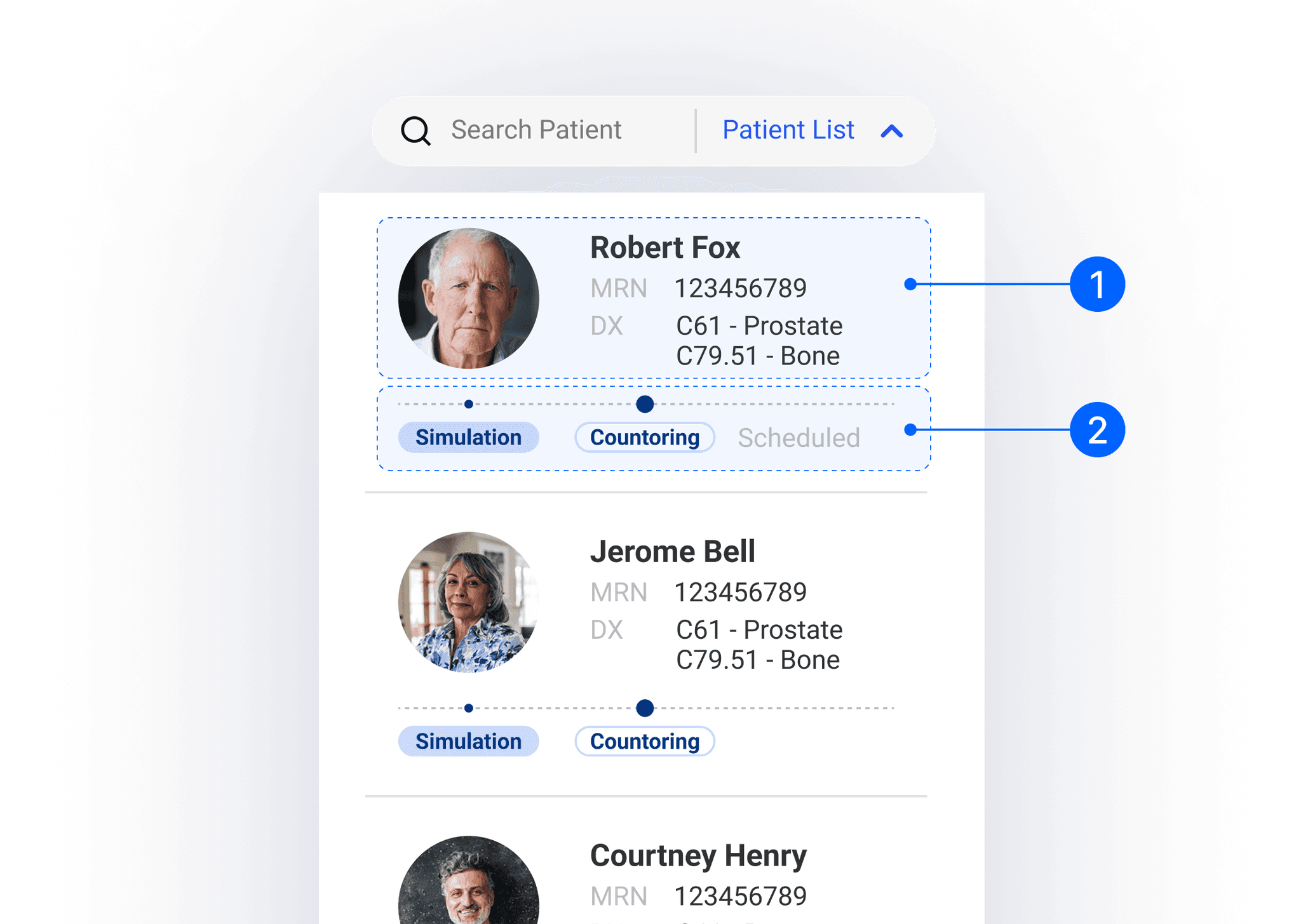
Locate target patients efficiently
In the layout exploration, we have already eliminated the full patient list options due to space constraints. Our next step is to find a way to hide the full patient list while still allowing it to be displayed when necessary, along with a search option. It helpa the medical team quickly find a patient.
Final
Keep only critical information on the drop-down patient card
Name, MRN, heatshot, diagnosis
A treatment process bar that clearly shows the current status and upcoming steps
Before
Folded side bar
The folded sidebar provides a way to hide the patient list, helping to save space on the main page.
It includes an indicator, a small chevron, which lets users know that additional information is hidden there.
The search bar will be hidden along with the sidebar, potentially making it less accessible.
After
Drop-down list
The drop-down list allows the search bar to remain on the top bar, providing a clear indicator for accessing and searching the patient list.
It helps save space on the main page, keeping the layout clean and organized.
Click the Prototype
Takeaways
Embrace uncertainty, evolve through ambiguity and master domain knowledge quickly.
Project development is never a linear route; it always involves back and forth. From this project, I learned that clearing out ambiguity through communication and testing is crucial. This process helps transition anything from vague to clear.
Prioritize and navigate data for effective design
From this project, I learned how to identify prioritized data and display it more efficiently. I also had the chance to understand the best practices for displaying structured data. Understanding how the data structure affects the layout is crucial, as it guides the design for the rest of the project.
© 2024 Yuanhao Wang. All Rights Reserved.


